Goal
My sister asked me to come up with the branding for her new business, “Liv’s Drink Emporium”. My sister and her husband have five kids and they know how expensive it can be for a meal out. With that in mind, they keep our prices low. You can get drinks and snacks for your family at a price that would normally cost the price of a single meal at an upscale restaurant in town. I wanted to present the Emporium as an upscale establishment and not portray it as a budget shop. Just because the food is cheap doesn’t mean the experience has to be.
How I achieved it
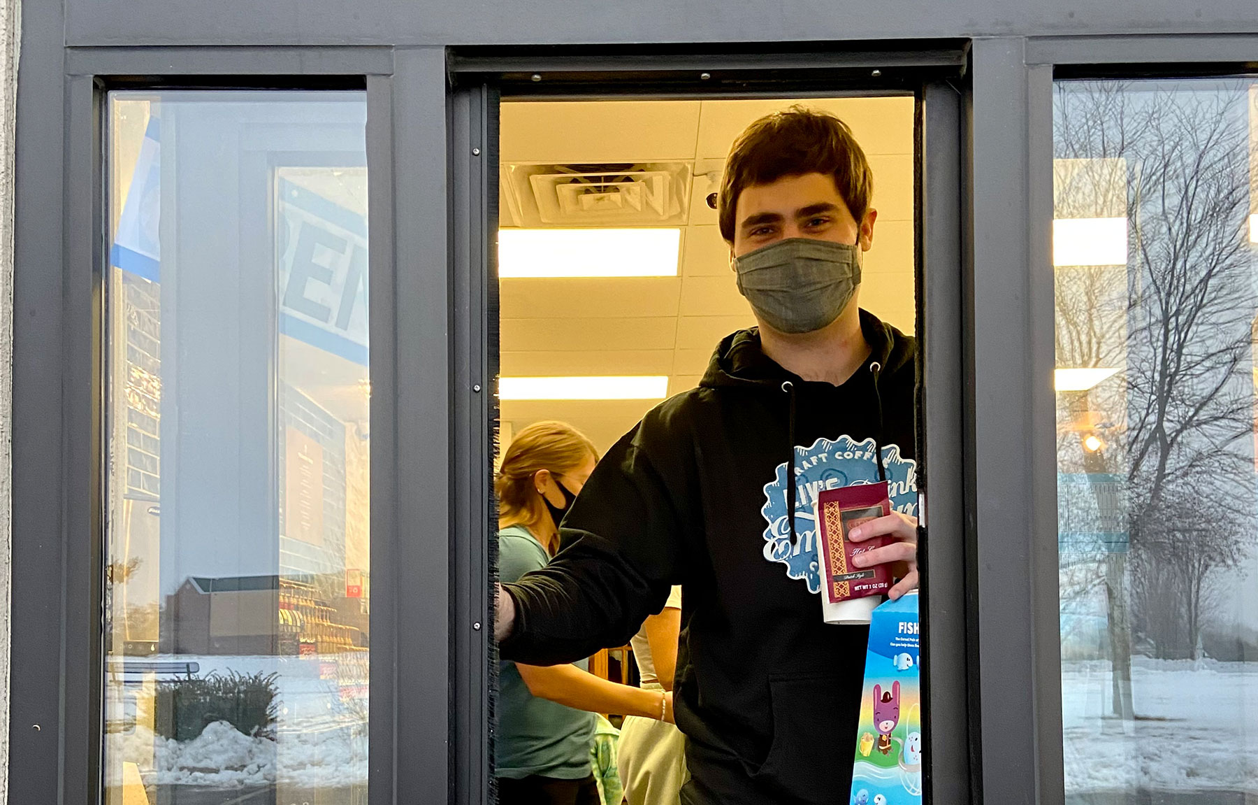
The logo is based on a bottle cap. The words sit on top of the cap and come off at the edges. I used a font similar to the classic coca-cola typography to represent the “soda shop”. There are also subtle bubbles etched on the bottle cap behind the type.
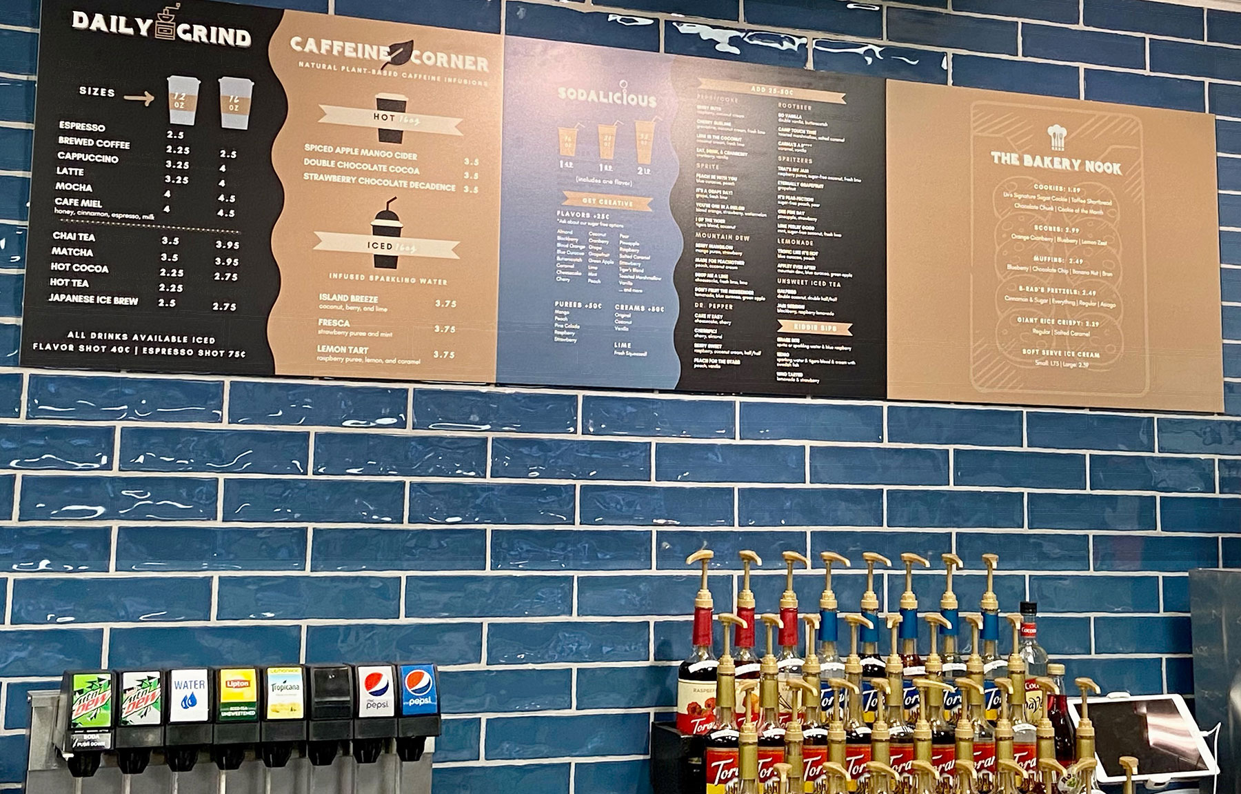
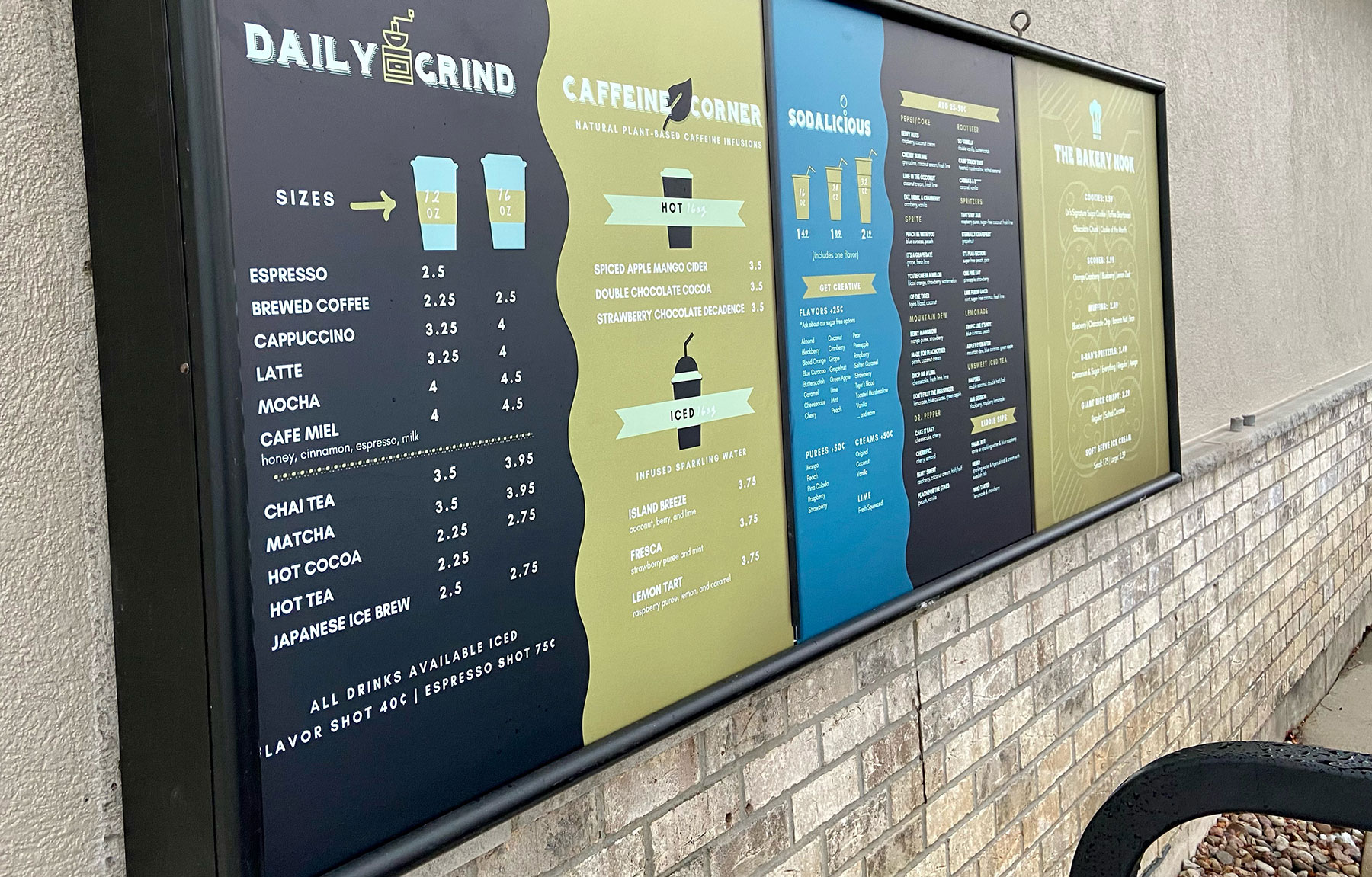
The next step was to create the menus. There are three distinct sections of the menu, 1) Soda 2) Coffee 3) Bakery. I created logos for each section that act as headings for the menu items. Each section has it’s own colored background based on the tile colors in the restaurant. I printed out sections of the drive-thru menu and pasted them seven feet away on my wall to make sure they were legible at a distance. I was happy to see they were legible in person!
The last part of the branding was the website. I made sure to carry out the upscale look of the Emporium by adding a dark background and wood textures to set off the blue logo. Video elements are used throughout the website to bring attention to the menu section logos that I had created. The next step will be to integrate online-ordering into the menu system which will be coming soon.