Goal
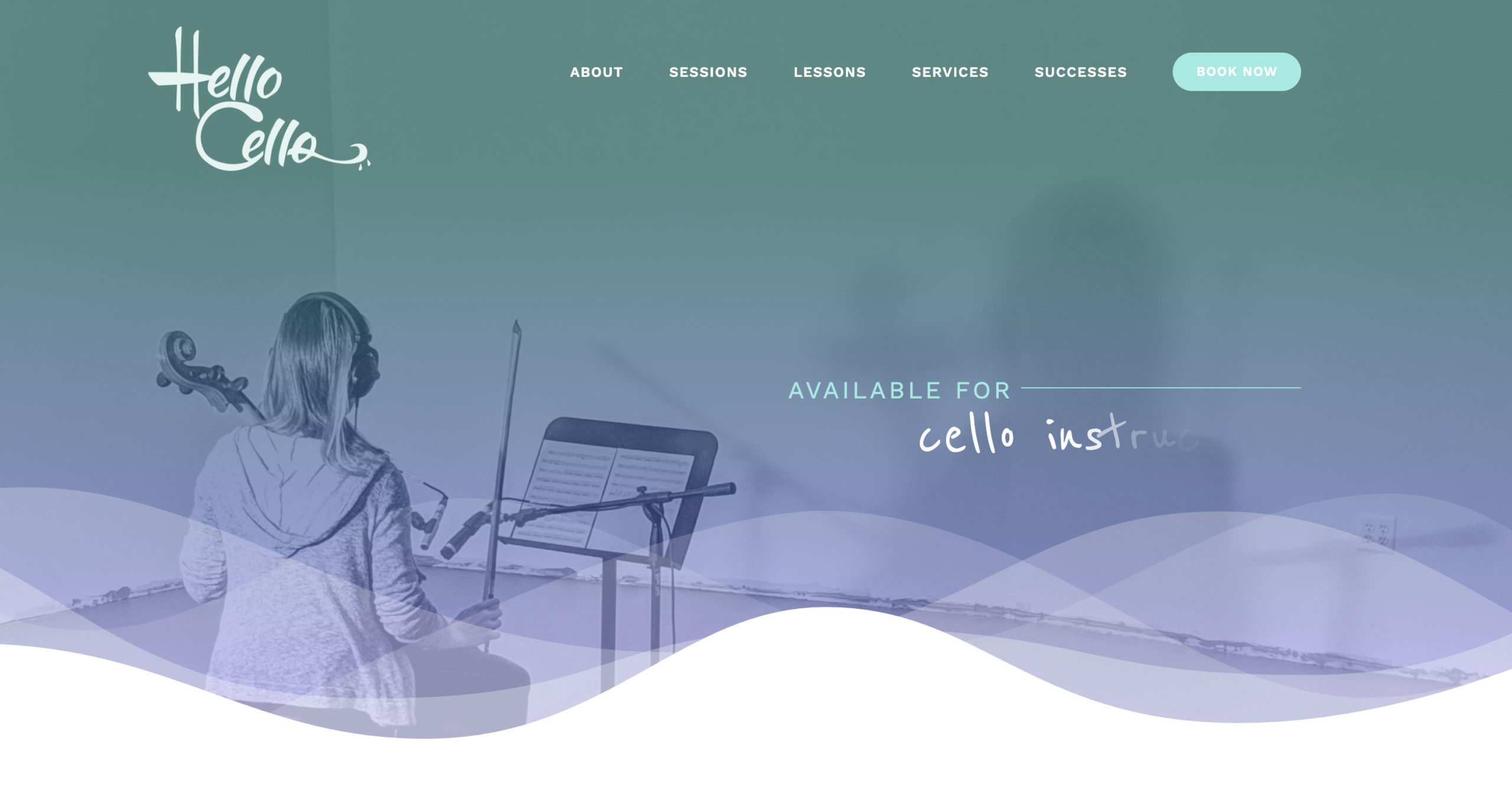
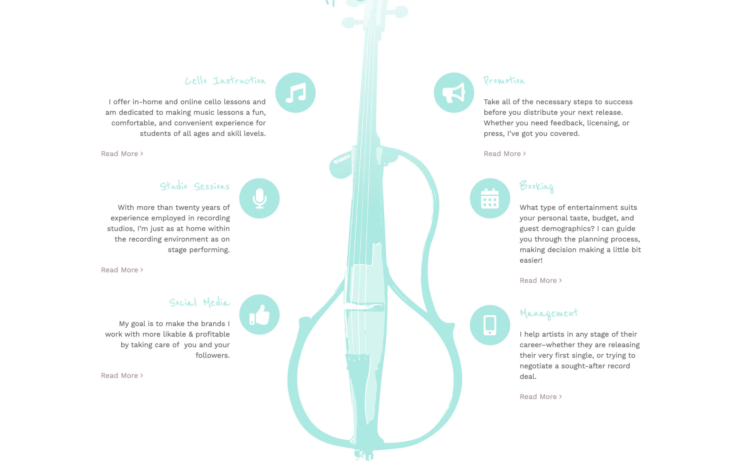
Hello Cello wears a lot of hats! Thea Vorass (my wife) offers cello lessons, studio sessions, band promotion, booking, and social media management. With all of these services, her website needed a cohesive look and easy to use interface to display her many services and talents.
How I achieved it
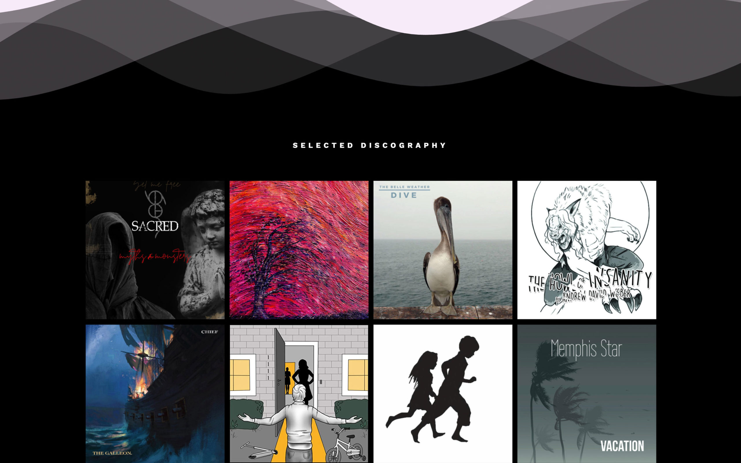
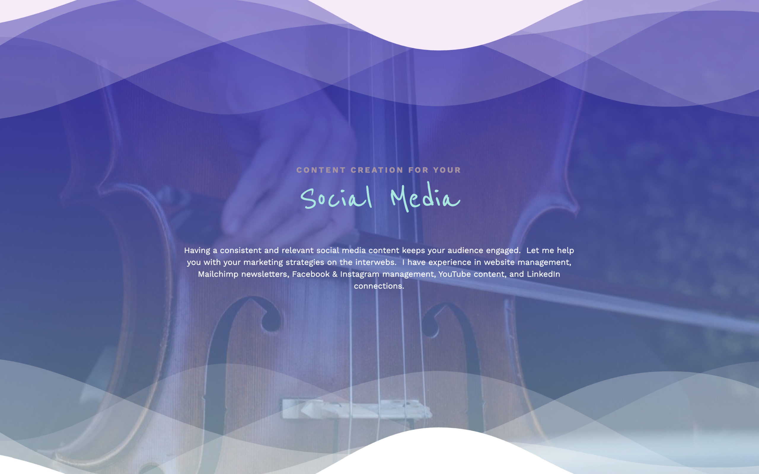
I talked to Thea about how she wanted the site to look and feel. The lines of the cello are fluid and curved and we wanted to portray that throughout the design so I used this as the main design feature. I had created her logo last year and wanted the typography to fit together as a family and I found a nice handwritten font to tie in the friendly character of the site. The colors are based on Thea’s aqua blue which she had used in the past. I chose purple which is a great compliment to fade in and out of the wavy curvy features.
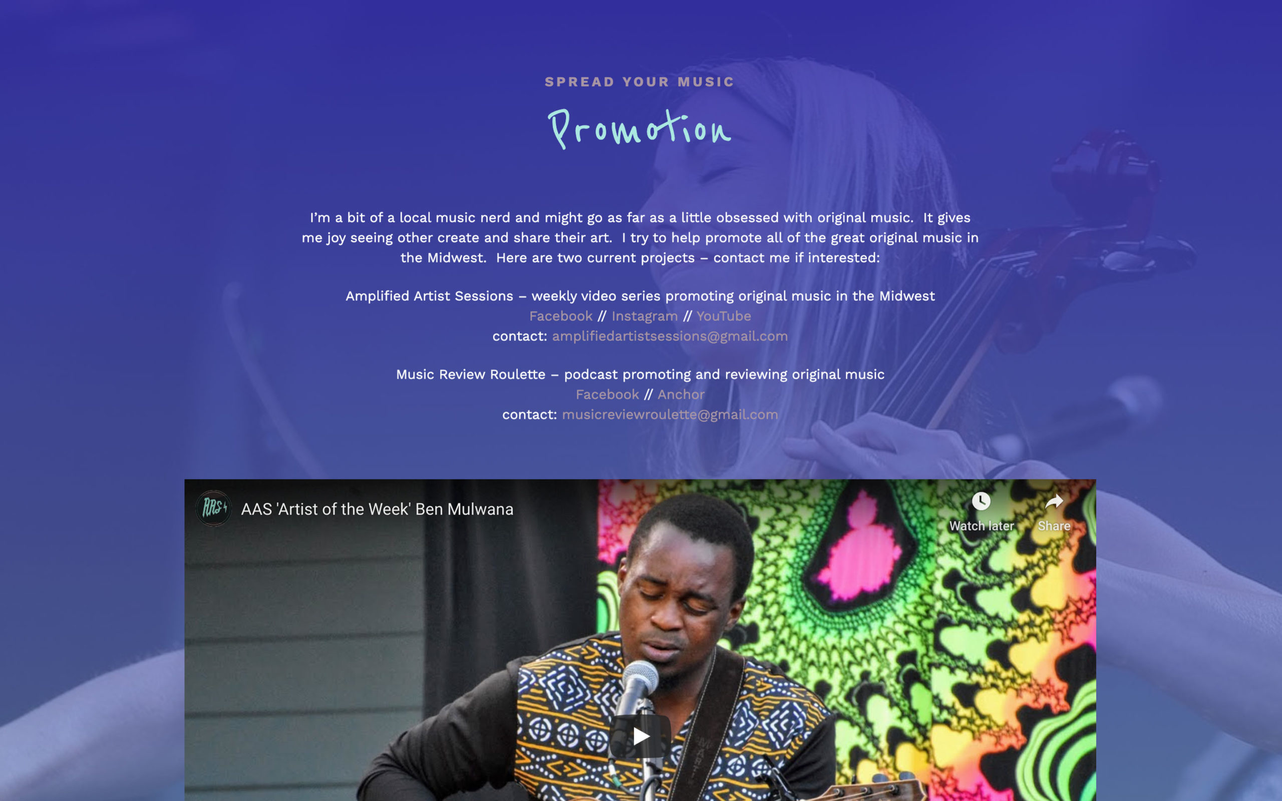
The site is built on WordPress making use of re-usable content blocks that she can store and save. For example, the testimonials block only has to be updated in one instance and can be placed throughout the site as needed. Each page features different images of Thea performing with various artists and utilizing the aqua and purple gradients over the top of them to tie in the theme. Thanks for looking!
